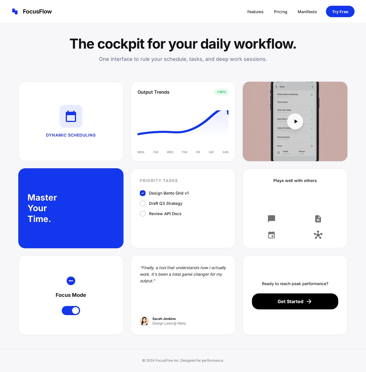
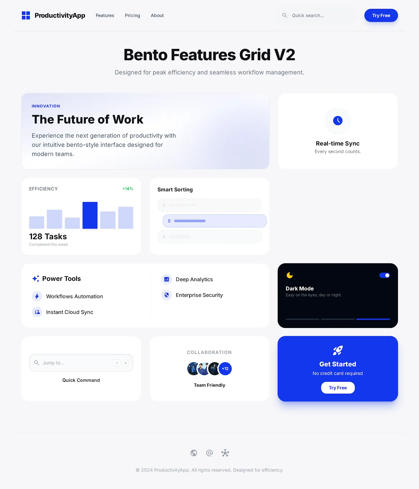
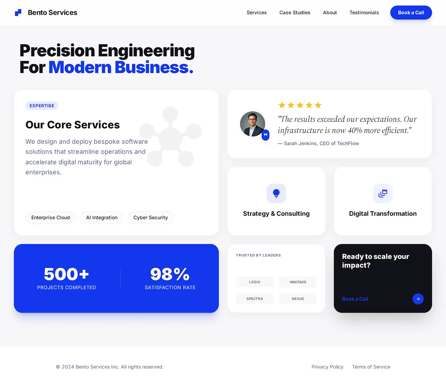
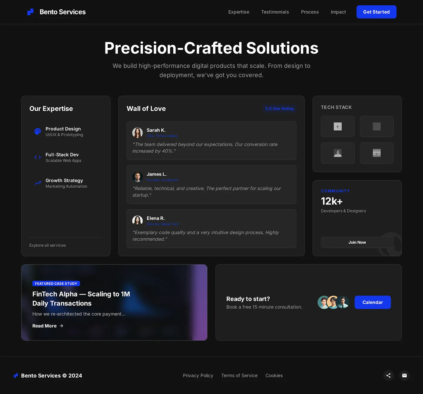
Bento Grid Features
A modular, highly responsive feature showcase using the popular bento box layout trend. Designed for scalability and visual clarity.
Date January 2025
Stack
ReactTailwind CSSFramer Motion
The Concept
The “Bento” layout has become a staple in modern SaaS web design for its ability to organize complex information into digestible, bite-sized chunks. This project explores various iterations of this pattern, focusing on how grid areas can be manipulated to highlight different content hierarchies.
Implementation Details
We utilized CSS Grid as the core layout engine, allowing for complex, two-dimensional arrangements that adapt fluidly to different screen sizes. Each “cell” in the bento box is a self-contained component, making the system highly modular.
Key Features
- Responsive Grid: The layout seamlessly transforms from a multi-column desktop view to a stacked mobile view.
- Micro-interactions: Subtle hover states and animations bring life to static content blocks.
- Content Flexibility: The grid accommodates various content types, from text and icons to rich media and data visualizations.
Project Highlights
- ✓ Performance score of 95+
- ✓ Fully responsive design
- ✓ SEO optimized structure