Blog
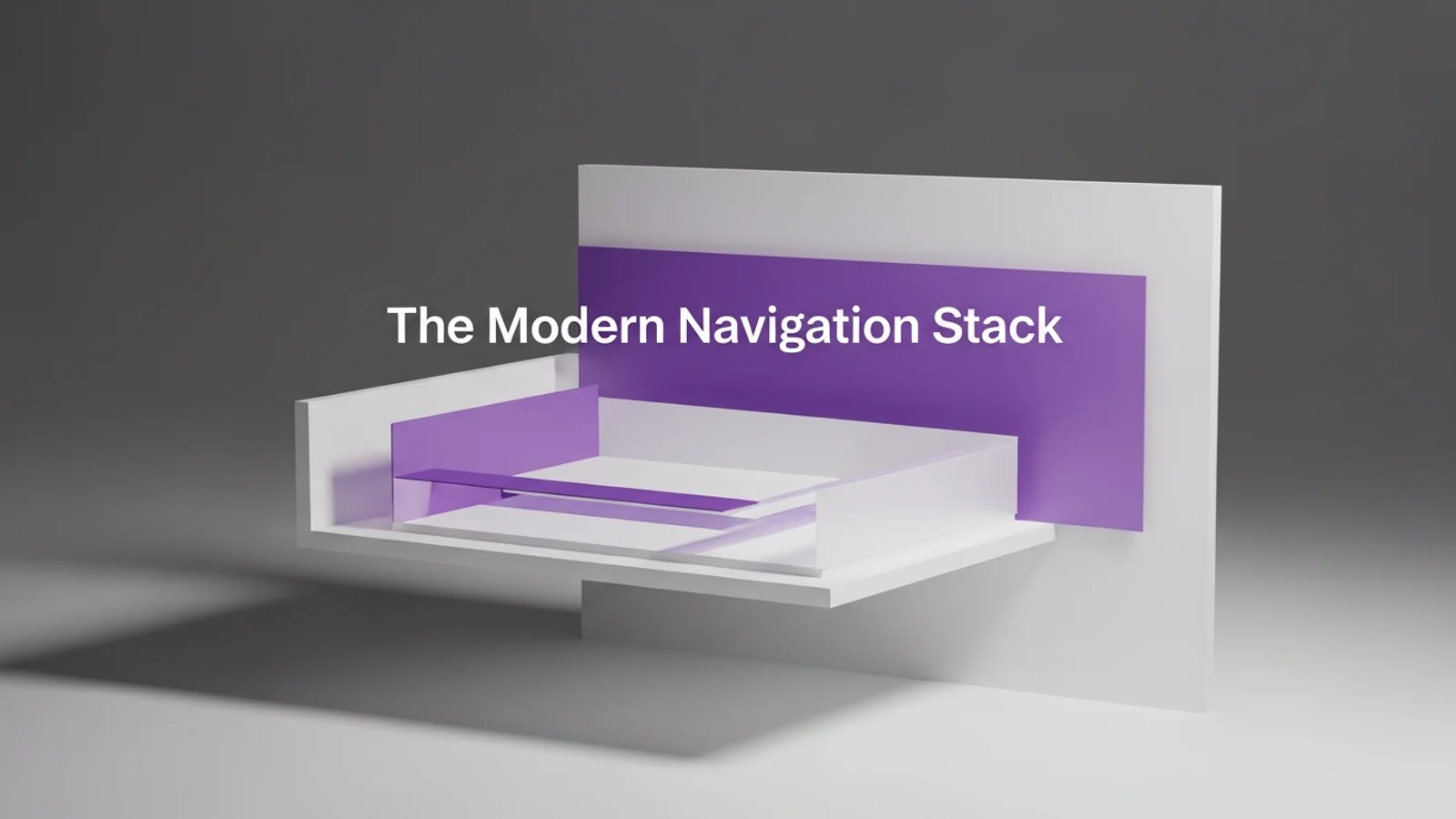
The Modern Navigation Stack
Published 2025-09-11
Navigation is not just a header. It is a system that helps people stay oriented. A modern navigation stack blends a clean top bar with in-page guidance and strong mobile behavior.
Keep the primary nav short
Too many items create noise.
- 5 to 7 primary links
- One clear CTA
- No duplicate entries
If everything is in the nav, nothing stands out.
Use a sticky header that feels light
Sticky is useful, but it should not dominate.
- Smaller height on scroll
- Subtle background tint
- Clear focus states for keyboard users
The header should guide, not block.
Add in-page anchors for long pages
When a page is long, add a local section nav.
- 4 to 6 anchors max
- Short labels
- Scroll position indicator if possible
This is especially useful for pricing, docs, and long product pages.
Make mobile navigation decisive
Mobile menus should be simple and fast.
- Full-screen sheet or bottom drawer
- Large tap targets
- Fewer nested layers
If the menu is complex, users bounce.
Add search when content grows
Once you have more than 20 posts or docs, search pays off. It removes friction and improves discovery.
Quick checklist
- Can you scan the nav in 3 seconds?
- Is the CTA visually distinct?
- Do long pages have anchors?
- Does mobile navigation feel effortless?
Good navigation makes the rest of your design feel easier to trust.