Blog
Micro-Interactions Without the Bloat
Published 2025-10-09
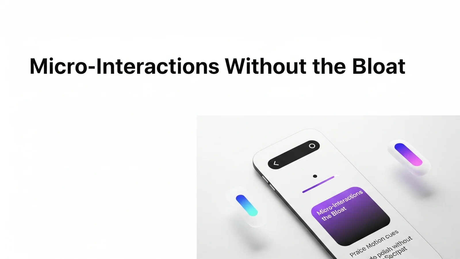
Micro-interactions are the details that make a site feel alive. You do not need heavy libraries to get there. Most of the best motion can be done with simple CSS and a clear design system.
Focus on the key states
A small set of states creates most of the polish.
- Hover: subtle lift or tint
- Active: small press effect
- Focus: clear outline and glow
- Loading: gentle shimmer or spinner
If you cover these, the interface already feels responsive.
Keep motion subtle
Large motion breaks rhythm and slows scanning.
- 150 to 250ms transitions
- Ease curves that start fast and end slow
- Only move along one axis at a time
Small motion is more premium than big motion.
Use transform and opacity
These properties are cheap to animate.
.button {
  transition: transform 180ms ease, box-shadow 180ms ease;
}
.button:hover {
  transform: translateY(-2px);
  box-shadow: 0 8px 20px rgba(15, 23, 42, 0.12);
}
.button:active {
  transform: translateY(0);
}
Respect reduced motion preferences
Users who prefer reduced motion should still get a clean UI.
@media (prefers-reduced-motion: reduce) {
  * {
    animation-duration: 0.01ms !important;
    animation-iteration-count: 1 !important;
    transition-duration: 0.01ms !important;
  }
}
Quick checklist
- Do hover and focus states feel intentional?
- Are transitions fast enough to not slow reading?
- Do animations use transform and opacity?
- Is reduced motion supported?
Micro-interactions are a small investment that makes a big difference in perceived quality.