Blog
Section Architecture for Scannability
Published 2025-07-10
People scan first, then commit. Section architecture helps you control that scan. It gives every block a purpose so the page feels easy, not endless.
Give every section a job
A clean structure usually follows this flow:
- Problem or tension
- Solution or promise
- Proof or validation
- How it works
- Secondary proof
- Final CTA
You can skip a step, but do not repeat the same job twice.
Keep sections compact
Each section should make one point and move on.
- 1 headline
- 1 supporting sentence
- 3 to 5 bullets or tiles
If a section needs two headlines, it is two sections.
Use layout rhythm to guide the eye
Alternating patterns keep users engaged.
- Swap image left and right
- Alternate background tints
- Vary section density (tight, medium, spacious)
Rhythm helps the reader stay oriented.
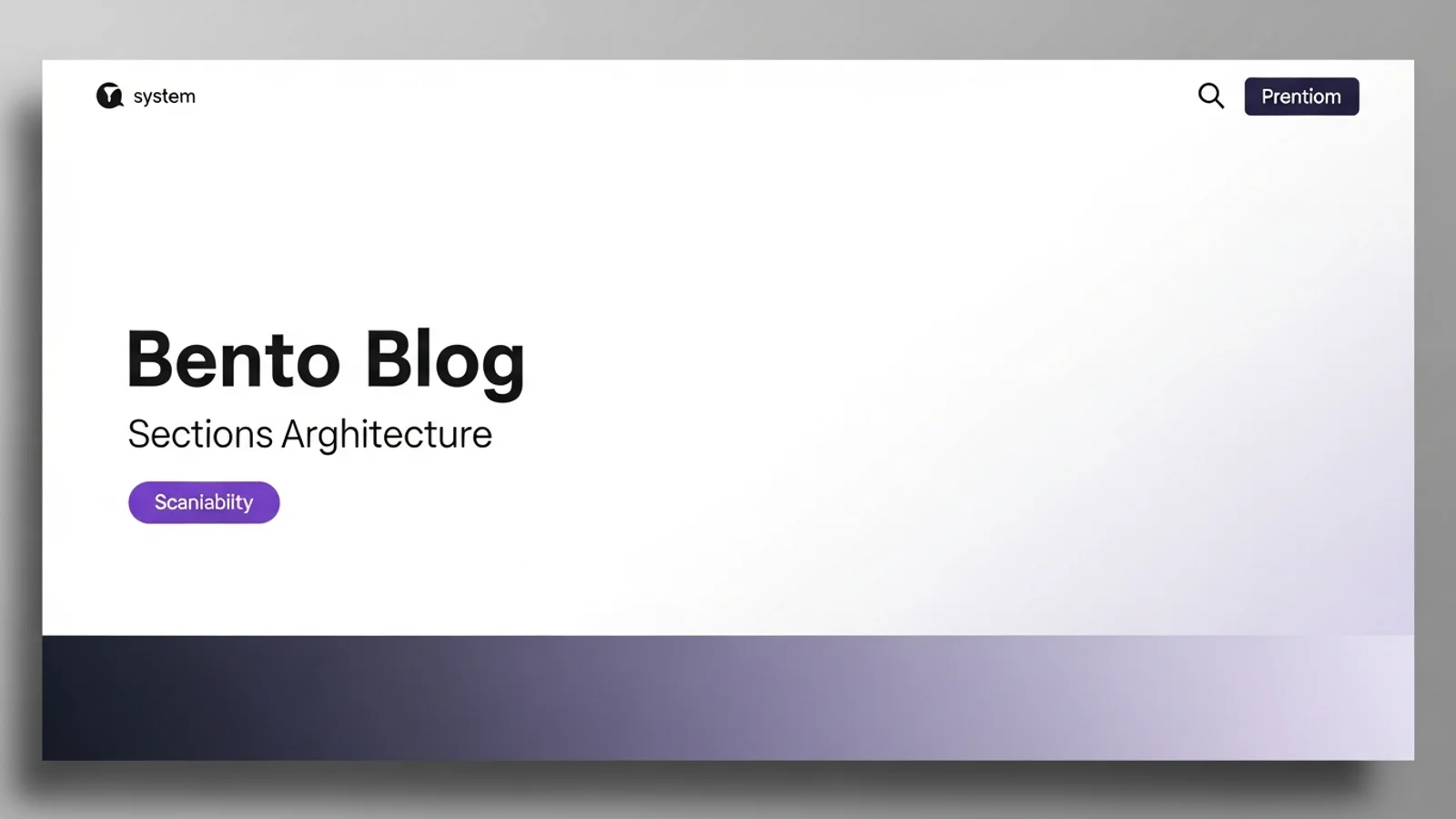
Add section summaries
Short summaries make scanning fast.
- Bold lead sentence
- Short subhead
- Clear visual anchor
This is what makes a page feel skimmable on first pass.
Respect vertical spacing
Spacing is the easiest way to signal structure.
- Use a consistent vertical scale (48, 72, 96)
- Make transitions between sections obvious
- Avoid stacking too many cards in one section
The space is part of the design.
AI is useful here as an audit tool, not a writer. Drop your live page into a workflow that scores each section against the six-step flow above and flags duplicates, missing CTAs, and sections doing two jobs at once. You get a one-page report with concrete edits — twenty minutes to fix what would otherwise be invisible to the team that wrote the page.
Quick checklist
- Can you describe each section in one sentence?
- Do sections have one primary action?
- Does the layout alternate to keep rhythm?
- Can someone skim the page and understand it?
A page with good section architecture feels calm. It helps users move confidently from curiosity to action.