Blog
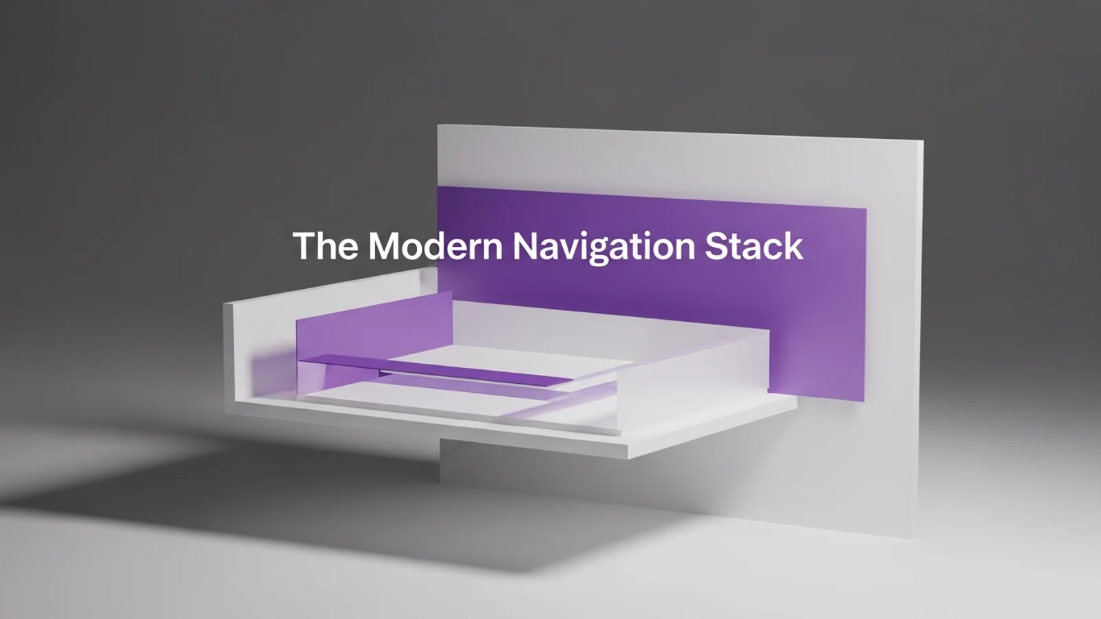
Bento Grids for Marketing Sites
Published 2025-02-13
If your homepage feels like a long essay, a bento grid can turn it into a menu. You still tell a story, but each tile earns its keep. The result is a layout that reads fast, highlights value, and feels intentional without being rigid.
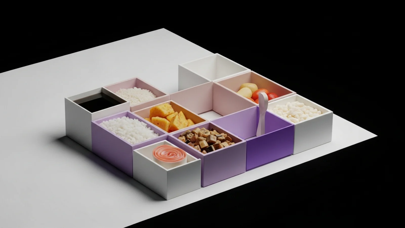
What makes a layout feel like “bento”
Bento isn’t just a grid. It’s a system for packaging content into clear, comparable blocks:
- One idea per tile.
- Consistent spacing and corner radius.
- Clear internal hierarchy (label, headline, support, action).
- A visual rhythm of big + small tiles.
If you squint and every tile still communicates something, you are on the right track.
Why bento works for marketing pages
1) Scannability wins.
Marketing pages are read like menus. Bento makes it easy to scan, pick a few items, and commit.
2) It feels premium.
The layout signals design maturity. When spacing and alignment are tight, trust goes up.
3) It is modular.
You can add or remove tiles without redesigning the entire page. That is perfect for fast iteration.
A reliable bento structure
Here is a simple structure that scales well from startup pages to mature products:
| Hero / Value (2x1) | Proof (1x1) | CTA (1x1) |
| Feature (1x1)      | Feature (1x1) | Feature (1x1) |
| Case Study (2x1)   | Integrations (1x1) |
You do not need to follow this exactly. The point is to mix sizes so your eye knows where to start and where to keep going.
Four tile types you can reuse
Hero tile
One sentence, a bold claim, one action. Keep the copy short and the visual strong.
Proof tile
Numbers, logos, or a single quote. This tile reduces perceived risk.
Feature tile
Small icon, short headline, 2 lines of benefit. Avoid lists inside lists.
Utility tile
FAQs, integrations, or “works with.” Keep these visually quieter so they do not compete.
Content rules that keep it clean
- Limit each tile to 30-60 words.
- Use verbs in headlines (Launch, Automate, Ship).
- Keep captions in the same voice across the grid.
- Prefer one primary action in the entire section.
If tiles start looking like mini landing pages, the grid has collapsed.
Responsive behavior that still feels like bento
On mobile, the grid should feel like a curated stack. Do not keep the desktop mosaic. Instead:
- Collapse to one column.
- Keep large tiles early.
- Preserve spacing between tiles so each still reads as a unit.
If all tiles look identical on mobile, the hierarchy is gone.
Small details that make it feel premium
- Use subtle background differences to separate tiles, not heavy borders.
- Keep a consistent radius across images and cards.
- Align titles to a baseline rhythm (4px or 8px).
- Add one standout visual tile to anchor the section.
A quick build checklist
- Does each tile say one thing?
- Is there a clear start tile?
- Do the sizes alternate in a pleasing rhythm?
- Does the grid still read on mobile?
- Is the CTA visible without scrolling?
Common mistakes
- Too many tiles. More than 9 and people stop scanning.
- Too many colors. Use one accent and one neutral family.
- Too much text. Bento is about fast comprehension.
Final take
Bento grids make marketing pages feel sharp, modern, and organized. The secret is not the grid itself, but the discipline: one idea per tile, consistent spacing, and a clear hierarchy. If you get those right, the layout sells for you.