Blog
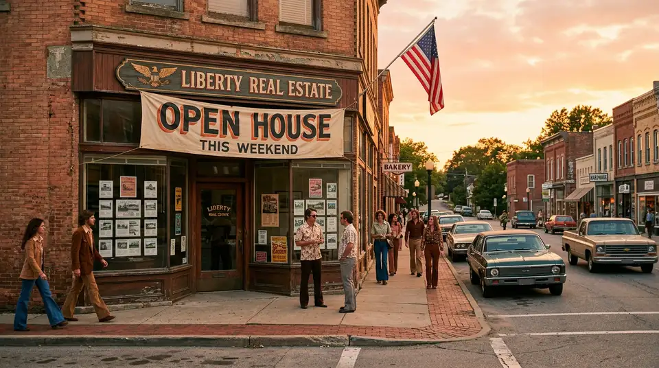
Real EstateTurn Each Property Into a Conversion Funnel
Published 2026-03-06
You would never walk a buyer into a property, point at the walls, and say “three bedrooms, two bathrooms, call me if interested.” That would be absurd. You would tell them a story. You would point out the light in the morning, the view from the kitchen, the fact that the best school in the district is a five-minute walk. You would read their body language and adjust.
But that is exactly what most real estate websites do. Here are the photos. Here are the specs. Contact agent.
No story. No context. No journey. Just a product sheet with a phone number at the bottom.
What if every listing on your website worked like a miniature sales presentation instead? One that guides a visitor from curiosity to inquiry in about 60 seconds, without feeling pushy or salesy?
That is what a property conversion funnel is. And it changes everything.
Why flat listings fail
If you have read Why Property Listings Alone Don’t Generate Leads, you already know the core problem: most listing pages are galleries, not sales tools. They show the property but do not sell it.
Here is what a flat listing looks like in practice. A visitor arrives from Google or a portal link. They see photos, scroll through them, glance at the price, maybe read the feature list, and then… leave. The page gave them information but no reason to act. No emotional connection. No urgency. No next step that feels natural.
The average time on a real estate listing page is under 90 seconds. In that window, you need to take someone from “just browsing” to “I want to know more.” A photo carousel and a bullet list cannot do that job alone.
Dedicated property landing pages — pages designed as a journey, not just an information dump — convert 3 to 5 times better than standard listing templates. Same property, same price, same photos. But the structure does the selling.
The anatomy of a listing that converts
Think of a property page as five acts, like a short film. Each section has a job. If any section fails, the visitor drops off. If they all work together, the visitor arrives at the end ready to take action.
Act 1: The hero — stop the scroll
The first thing a visitor sees determines whether they stay or leave. You have about three seconds.
Your hero section needs three things: the best photo you have (not the exterior — the shot with the most emotional pull, usually the living space with natural light), the price, and the location. Nothing else.
No feature lists. No agent headshot. No “listing ID: 47293.” Just the image, the price, and the place. Let the photo do what photos do — create desire.
If the property has a standout feature, hint at it here. “Penthouse with wraparound terrace” or “Garden flat, 30 seconds from the park.” One line that makes someone want to scroll down.
Act 2: The story — make it human
This is the section most agents skip entirely, and it is the most important one.
After the hero, do not jump to the spec list. Tell the story of the property. Not “this three-bedroom apartment features an open-plan kitchen” — that is a spec dressed up as a sentence. Tell someone what it feels like to live here.
“Morning light fills the kitchen from about 7am. The open layout means you can cook breakfast while keeping an eye on the kids in the living room. Step through the sliding doors onto the terrace, and you are looking at the park where half the neighborhood walks their dogs before work.”
This is not creative writing for its own sake. It is what you would actually say during a viewing. The difference is that on your website, you cannot adjust based on body language, so you need to paint the picture in advance.
Properties with narrative descriptions generate 27% more inquiries than those with feature-only descriptions. People do not buy square meters. They buy mornings on the terrace.
Act 3: The neighborhood — sell the location
Here is a stat that should change how you build listing pages: including neighborhood data increases property inquiries by 37%.
Most buyers are not just buying a home. They are buying a life. They want to know what is within walking distance. They want to know about schools, cafes, transport, parks, noise levels, safety. They want to know if this is a neighborhood where they will be happy.
Create a neighborhood section for each listing that covers:
- Walk time to the nearest transit stop
- School ratings and distance (if applicable)
- Three to five notable amenities within a 10-minute walk
- Average property price trend for the area (shows whether they are buying into growth)
- One honest note about the area’s character (“This is a quiet residential street” or “Lively neighborhood with restaurants and nightlife nearby”)
This is also a natural place to offer your neighborhood guide download — a deeper resource that captures an email in exchange for genuinely useful local information.
Act 4: The floor plan and tour — prove it
Now you bring in the technical details. Floor plan, virtual tour, room dimensions, building specs. This section exists for the people who are already interested and want to verify that the property works for their needs.
Video walkthroughs increase listing engagement by 49%. If you have a video tour, put it here. Not in the hero — that is too soon. By Act 4, the visitor is already interested and wants to explore. The video feels like a reward, not a hurdle.
If you do not have video, a well-annotated floor plan with room dimensions does the job. Add a compass orientation so people can figure out light direction. Mention ceiling heights if they are notable. These details signal that you know your product and care about accuracy.
Act 5: The specific CTA — make it easy
This is where most listing pages fall apart. After all that work building interest, they throw up a generic “Contact Agent” form and hope for the best.
Your CTA needs to be specific. Not “get in touch” but one of these:
- “Book a private viewing this week” (with available time slots)
- “Get the full property report” (detailed PDF with financials, comparables, and neighborhood data)
- “Ask a question about this property” (low-commitment, specific to this listing)
Better yet, offer all three. Different visitors are at different stages. The person ready to visit wants the calendar. The person doing research wants the report. The person with one specific concern wants to ask a question without committing to a call.
Each of these captures contact information in a way that feels natural, not forced. And each tells you something about the lead’s intent, which matters enormously for qualifying them before follow-up.
The AI layer
The five-act structure is the easy part. The hard part is writing 30 unique property stories per month — agents skip Act 2 not because they don’t believe in it, but because there are 30 listings and 24 hours in a day.
AI handles the bottleneck. Feed a workflow with the listing’s photos, specs, neighborhood, and three voice-noted observations from your viewing (“morning sun in the kitchen, the master is quieter than expected, the building has a dog park”) and get back a 220-word Act 2 draft in your tone. Not a generic template — specific to this unit, with this light, in this neighborhood.
You read the draft, fix the one sentence that didn’t quite land, publish. Six minutes per listing instead of forty. Thirty listings on the website with proper Act 2 narrative instead of three.
The same workflow drafts the neighborhood section (Act 3) from a 5-mile data feed — transit times, school ratings, café density, average area prices. Facts AI is good at compressing into prose. You add the one honest note about the area’s character. Three minutes per listing.
When the bottleneck is writing, AI is the leverage. The five-act structure scales because the writing scales.
The 60-second journey
When all five acts work together, here is what happens in a visitor’s experience:
Second 0-3: They see the hero photo and price. It matches what they are looking for. They stay.
Second 3-15: They read the story. They can picture themselves in the kitchen. They are emotionally engaged.
Second 15-30: They scan the neighborhood section. Good schools, close to transit, area prices are trending up. This checks out.
Second 30-50: They look at the floor plan. The layout works. The living room is bigger than they expected. They watch 30 seconds of the video tour.
Second 50-60: They see the CTA. “Book a private viewing this week.” There is a slot available Thursday afternoon. They book it.
60 seconds. From stranger to scheduled viewing. That is what a conversion funnel does.
Real numbers: flat listing vs. funnel
Let us put actual numbers on this.
A standard listing page with photos, specs, and a contact form converts around 1% of visitors. For every 100 people who visit the page, one person fills out the form.
A property page structured as a funnel — hero, story, neighborhood, tour, specific CTA — converts between 3% and 5%. Same traffic, same property, 3 to 5 times the leads.
Now multiply that across your portfolio. If you have 30 active listings and each gets 200 visits per month, a flat listing approach gives you about 60 leads per month. A funnel approach gives you 180 to 300.
That is not a marginal improvement. That is a different business.
And remember, these are not cold leads from a portal. These are people who visited your website, engaged with your content, and took a specific action. They are warmer, more informed, and more likely to convert to a sale.
Common mistakes to avoid
Putting agent info above the property
Nobody came to the page to learn about you. They came to see the property. Your bio and headshot belong at the bottom, near the CTA, where social proof helps close the deal. Not at the top, where it distracts from the listing.
Using the same photos as the portal
If your website shows the exact same photos in the exact same order as Zillow or Rightmove or Immobiliare, why would anyone visit your site? Lead with different images. Use the portal for the standard shots and your website for the premium content — the video tour, the neighborhood detail, the story.
Hiding the price
Some agents like to withhold the price to force inquiries. This backfires badly online. Visitors who cannot see a price leave immediately because they assume it is out of their range (or that you are playing games). Transparency builds trust. Show the price.
One CTA at the very bottom
If someone has to scroll through 2000 pixels of content to find a way to take action, you have lost most of them. Include a soft CTA after Act 2 (the neighborhood guide download) and the main CTA after Act 5. Give people multiple chances to engage at their own pace.
The system view: every listing works for you
When you structure every listing as a funnel, your website becomes a collection of miniature sales presentations that work 24 hours a day.
Each property page is not just advertising one home. It is capturing leads for your entire business. Someone who comes for a two-bedroom apartment but downloads the neighborhood guide might end up buying a three-bedroom house in the same area six months later. You have the relationship because your listing page created it.
This is the core idea behind building a real estate website that works like a sales agent. Each listing is not a standalone advertisement. It is a node in a system that captures, qualifies, and nurtures every visitor.
A gallery shows properties. A funnel sells them. And the difference between the two is not budget or technology. It is structure.