Blog
SpasHow to Use Visual Content to Sell Relaxation Before Arrival
Published 2026-01-30
Close your eyes for a second. Warm towels, fresh off the steamer. A faint eucalyptus scent in the air. Dim lighting. Soft music — not loud enough to identify the song, just loud enough to notice if it stopped. A robe that feels like it costs more than your jacket.
You felt something just now. A slight exhale. A micro-relaxation. And you are sitting at your desk reading a blog post.
That is what your website should do. It should make people feel the experience before they book it. Before they even know your prices. Before they know where you are located. They should feel what it is like to be in your space, and then the booking is just the natural next step.
Most spa websites do the opposite. They tell people about relaxation using the least relaxing medium possible: walls of text, clip art icons, and stock photos that look like they were shot in a laboratory.
The stock photo problem
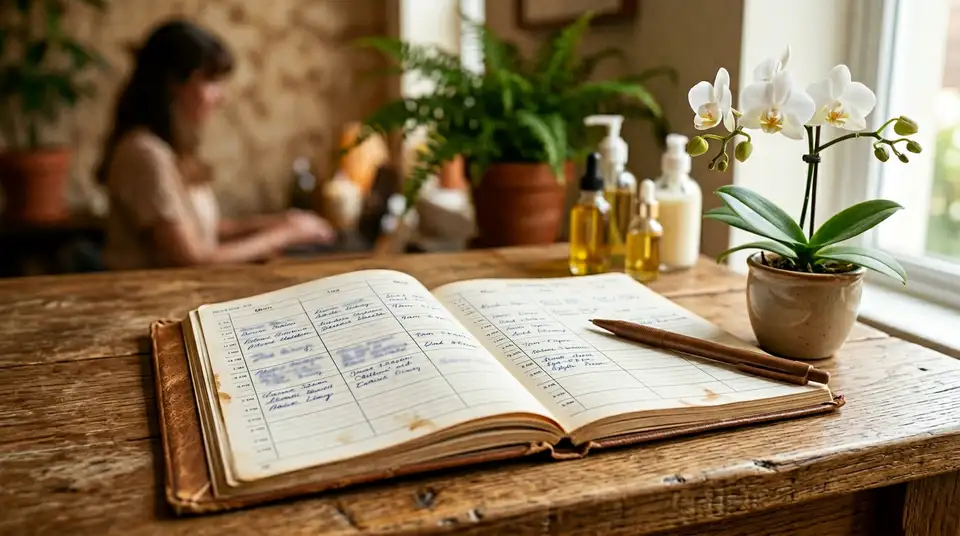
You know the photos I am talking about. The woman with a white headband, eyes closed, lying face down on a massage table. The stack of smooth stones. The row of candles next to a bamboo mat. The orchid.
Every spa website in the world uses some version of these. And the moment a potential client sees them, their brain files your website under “generic spa” and moves on.
Here is the data that should make you delete your stock photos today: original images get 94% more views than stock photography. That is not a small difference. People can tell — instantly, unconsciously — whether a photo is real or staged. Stock photos trigger the same mental response as banner ads. People’s eyes slide right past them.
Your treatment rooms, your products, your team, the way light falls through your window at 2 PM — those are unique to you. A stock photo of hot stones is unique to nobody.
Why visuals matter more for spas than almost any other business
Visual content is processed by the brain 60,000 times faster than text. That number sounds made up, but it comes from research on how the visual cortex handles information compared to language processing centers. The point is not the exact multiple — it is that images create an emotional response before the conscious mind even engages.
This matters for every business, but it matters disproportionately for spas. Here is why.
You are selling a sensory experience. Not a product someone can hold. Not a service with a measurable output like clean gutters or a filed tax return. You are selling a feeling. And feelings are communicated through images and motion, not through bullet points.
When someone is deciding whether to book a spa treatment, they are trying to imagine themselves in your space. They are trying to pre-feel the experience. Your website’s job is to make that imagination as vivid and accurate as possible.
Text can describe warmth. A photo of your actual treatment room, softly lit, towels folded just so, a practitioner’s hands ready — that photo does not describe warmth. It transmits it.
What to shoot (and you do not need a professional)
Let me save you the ฿25,000 photography quote. You can do this yourself with a phone, and the results will be better than stock photos. Not because your phone is magic, but because authenticity beats polish every single time in this industry.
Here is your shot list for one afternoon of focused content creation.
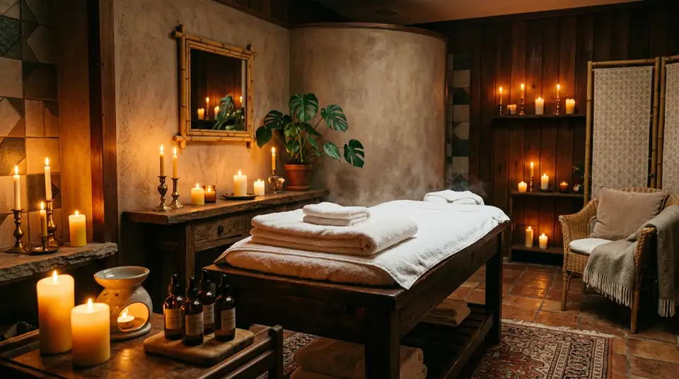
Your space, empty and inviting
Shoot your treatment rooms when they are set up for a client but before the client arrives. This is your “stage is set” moment. The bed is made, the towels are folded, the lighting is right, maybe there is steam coming off a hot towel. These photos say “this is waiting for you.”
Shoot from the doorway so the viewer feels like they are about to walk in. Shoot a detail of the pillow arrangement. Shoot the products lined up on the shelf. Shoot the hallway that leads to the treatment rooms — that transition from the outside world to your quiet space.
Natural light is your best friend. If your treatment rooms are dark, shoot the reception area, the relaxation lounge, any space where daylight comes in. For darker rooms, turn on whatever ambient lighting you normally use and let the camera adjust. Modern phone cameras handle low light remarkably well.
Hands at work
These are the most powerful images a spa can have. A practitioner’s hands on someone’s shoulder. Fingers pressing into the sole of a foot. Hands wrapping a warm towel. Applying a mask. Pouring oil.
You do not need to show the client’s face. In fact, it is better if you do not — it lets the viewer imagine themselves in that position. Shoot from the side or above, focused on the hands and the area being worked on.
These images communicate skill, care, and human touch. They are impossible to replicate with stock photography because they are specific to your practitioners and your technique.
Ask a staff member or a friend to be your model. Get their written consent for using the images on your website. One 30-minute session will give you enough hand-at-work shots for your entire site.
The details that create atmosphere
The small things are what separate a spa from a massage table in a strip mall. Photograph them.
A close-up of your essential oil bottles with the labels visible. The texture of your towels. The flicker of a candle. Water being poured into a glass with a slice of cucumber. A robe hung on a hook. The products you use, arranged thoughtfully.
These detail shots serve double duty. On your website, they fill the visual spaces between sections and create a sense of richness. On social media, they are perfect for posts and stories that remind people your space exists.
Your team, being human
Not stiff headshots against a white wall. Real photos of your practitioners in their element. A candid shot of someone preparing a treatment room. A therapist smiling at the front desk. The team sharing a laugh in the break room.
People book with people. As I covered in the piece on converting high-value clients, practitioner photos and bios dramatically increase booking rates. The more human and approachable your team looks online, the lower the barrier for a first-time client to walk through your door.
Video: the conversion multiplier
If one photo is worth a thousand words, a 15-second video of your space is worth about ten photos. Video backgrounds on spa websites increase time-on-page by 21%. And time-on-page is one of the strongest predictors of conversion.
You do not need a production crew. You need your phone, a steady hand (or a cheap tripod), and 20 minutes.
The slow pan
Walk through your space slowly. Start at the entrance, move through the hallway, into a treatment room. Keep the phone steady, move at the pace of someone taking a deep breath. No music — you will add that later, or just let it play silent on autoloop as a background element.
This single video, trimmed to 10-15 seconds and looped on your homepage, will transform the feeling of your entire website. It is the closest thing to walking through your door without actually being there.
The treatment in motion
A 20-second clip of a treatment in progress. The rhythmic motion of massage. Oil being warmed in someone’s palms. A hot stone being placed. The movement is inherently calming to watch, which means the viewer is literally beginning to relax while browsing your site.
That is not a metaphor. Mirror neurons fire when we watch someone else receive a calming experience. Your video is doing the pre-selling before a single word is read.
The detail loop
A 5-8 second loop of a small detail. Water flowing over stones. Steam rising from a towel. Essential oil being dropped into a diffuser. These micro-videos work perfectly as background elements on treatment pages or as social media content that stops the scroll.
Where to put your visuals
Having great visual content is only half the job. Placement matters as much as quality.
Homepage: full-width, above the fold
The first thing anyone sees on your website should be a full-width image or video of your actual space. Not a stock photo with text over it. Not a slideshow of five different images that cycle too fast to process. One strong, real image (or a silent looping video) that says “this is what we feel like.”
Treatment pages: show the experience
Every treatment page should have at least one original image. Ideally, a photo that matches the specific treatment — hands working on a back for the massage page, a face mask being applied for the facial page, a couple in robes for the couples page.
These images replace the need for long descriptions. A client looking at your deep tissue page sees a photo of strong hands working a knotted shoulder, and they understand the treatment in a way no paragraph could communicate.
Booking page: reduce anxiety
Put a warm, inviting photo on your booking page. The moment someone is about to commit their time and money, a visual of your peaceful space reinforces their decision. It is a small thing, but it reduces the last-second hesitation that kills conversions.
This pairs directly with how you structure the booking flow itself. A clean, simple booking process alongside a reassuring visual is the highest-converting combination.
Google Business Profile: your most overlooked gallery
Your Google Business listing gets seen by more people than your website does. And Google lets you upload photos directly to your profile. Most spas have three blurry photos from their grand opening in 2018.
Upload 15-20 of your best images to your Google Business Profile. Update them seasonally. These photos show up when people search for spas in your area, and they are often the first impression a potential client gets — before they ever click through to your website.
What not to do
A few quick warnings based on mistakes I see constantly.
Do not use filters that make everything look blue or overly cool-toned. Spas are warm. Your photos should feel warm. If your phone automatically applies a cool filter, turn it off.
Do not use photos with text overlaid. Your website has its own typography system. A photo with “50% OFF FIRST VISIT” burned into the image looks cheap and cannot be updated.
Do not mix stock and original photography. The contrast makes the stock photos look even more fake and the original photos look unintentional. Commit to one direction. Real is always better.
Do not over-edit. A slight brightness adjustment and a gentle warm tone shift are fine. Heavy HDR, cranked saturation, or Instagram-style presets make your spa look like a nightclub flyer.
The system view: visuals are your silent salesperson
Here is the bigger picture. Every piece of visual content you create is an asset you own. It works on your website, on your Google profile, on your social media, in your email to returning clients, and in your WhatsApp messages.
One good photo session — a single afternoon — gives you content for months. That content sells for you around the clock, to every person who discovers your spa online, without you having to say a word.
Stock photos are rented credibility from a generic catalog. Your own images are proof that your space, your team, and your experience are real. And in an industry where the entire product is “how does this place make me feel,” proof beats promises every time.
The client scrolling through search results at 10 PM is making a decision based almost entirely on what they see. Give them something real to see. Give them your space, your hands, your details, your warmth.
Let them feel it before they arrive. The booking will take care of itself.