Blog
GymsHow to Turn Your Gym Website Into a Membership Machine
Published 2026-02-20

Pull up your gym’s website on your phone right now. Go ahead, I will wait.
What do you see? A wide-angle photo of an empty gym floor, maybe some dramatic lighting on the weight racks. A logo. A navigation bar with six or seven items. Somewhere below the fold — if you scroll — a class schedule that links to a PDF. And at the very bottom, a “Contact Us” button that opens your email app.
If this sounds familiar, you do not have a website. You have a digital brochure. And it is costing you members every single day.
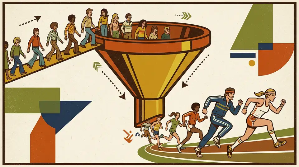
What 68% of your future members do before they visit
Here is a number that should reshape how you think about your online presence: 68% of prospective gym members visit a gym’s website before their first visit. Before they walk through your door, before they call, before they ask a friend — they Google you and check your site.
That means for every 10 people who eventually sign up, roughly 7 of them saw your website first and made a judgment call. And for every person who signed up, there are probably 3 or 4 who checked your website and decided not to come.
The average gym website converts between 1% and 3% of its visitors into leads. That means out of every 100 people who land on your site, 97 to 99 leave without taking any action. They do not call, they do not fill out a form, they do not book a visit.
The top-performing gym websites? They convert at 8% to 12%. Same industry, same audience, four to ten times more leads from the same amount of traffic.
The difference is not design talent or a bigger budget. The difference is structure. The high-performing sites are built to convert. The rest are built to exist.
Why your current website does not work
Let me walk through the typical gym website and point out where the money leaks happen.
The hero section says nothing
“Welcome to [Gym Name]” over a photo of empty equipment. This tells the visitor absolutely nothing about what you can do for them. They already know your name — they searched for it. And they do not care about your equipment. They care about their goals.
A hero section has one job: give the visitor a reason to keep scrolling. “Welcome to our gym” is not a reason. It is a greeting card.
The call to action is buried
Your most important action — booking a visit, starting a trial, requesting information — is either hidden in a sub-menu, buried at the bottom of the page, or phrased as “Contact Us,” which is the vaguest possible invitation.
“Contact Us” means: figure out what you want to say, open your email app, compose a message, and hope someone reads it. That is not a call to action. That is homework.
The class schedule is a PDF
You have a class schedule. Good. But it is a downloadable PDF that was designed for a printer, not a phone screen. The person checking your site at 9pm on a Tuesday, lying on the couch, wondering if they should finally start working out — that person is not going to download, pinch-zoom, and decode a PDF timetable.
There is no social proof
No testimonials. No before-and-after stories. No member photos. No Google review score. Nothing that says “other real people came here and got results.”
People do not buy gym memberships based on equipment specs. They buy based on whether they believe this gym will help them specifically. Social proof is how you build that belief.
Pricing is a mystery
“Contact us for pricing” is a conversion killer. People want to know what things cost before they commit to a conversation. If your pricing is not on your website, prospects assume one of two things: it is expensive and you are hiding it, or it is complicated and you are going to try to upsell them.
Both assumptions send them to the gym that shows its prices openly.
The fix: page by page
Here is how to turn your website from a brochure into a membership machine. Every page has exactly one job.
Homepage: convince them to explore
Your homepage is not about you. It is about the visitor and what they want.
The hero section needs a specific outcome statement. Not “Welcome to FitZone.” Instead: “Lose 10 kilos in 90 days — with a trainer who knows your name.” Or: “Strength training for people who hate gyms.” Or: “The only fitness studio in [city] with a 30-day money-back guarantee.”
Specific beats generic every time. The more precisely you describe who you help and what outcome you deliver, the more strongly the right person connects with your message.
Below the hero: a primary call to action. One button. Above the fold. Visible without scrolling. “Book Your Free Assessment” — not “Contact Us,” not “Learn More,” not “See Our Plans.” A specific action that matches a specific offer.
Below that: three to four member testimonials. Real names, real photos, real results. “I joined three months ago. Down 8 kilos and I actually look forward to training.” This is your most persuasive content. Real people who were in the same position as the visitor and got results.
Then a quick overview of what makes you different. Three short blocks. Maybe it is your trainer-to-member ratio, your class variety, or your flexible scheduling. Whatever it is, say it in one sentence per block.
That is the homepage. Convince, prove, differentiate, act.
Programs page: match them to the right fit
Most gym websites list their classes in a long, undifferentiated scroll. Yoga, spinning, crossfit, pilates, kickboxing, HIIT, strength, mobility — twenty options with no guidance.
A person who has never been to a gym does not know what they need. Giving them twenty options without context is the same as giving them zero options. They freeze.
Instead, organize your programs by goal. “Want to lose weight? Start here.” “Want to build muscle? These three programs.” “New to fitness? This is your path.”
Each program gets a short description, a photo of real members (not stock images) doing that activity, the schedule, and a button: “Book Your First Session.”
The job of this page is matching. Help the visitor see themselves in one of your programs, and make the next step obvious.
Pricing page: remove the doubt
Show your prices. All of them. Monthly, quarterly, annual. What is included at each tier. What the commitment looks like.
Yes, some competitors will see your pricing. They already know what you charge — the fitness world is small. The people you are hiding your prices from are not your competitors. They are your future members. And they will not call to find out what you cost. They will just go somewhere that tells them upfront.
If your pricing is genuinely competitive, showing it is an advantage. If it is premium, showing it is still an advantage — because it attracts people who value quality and filters out people who only shop on price.
Add a short FAQ below the pricing. “Can I freeze my membership?” “Is there a contract?” “What if I want to cancel?” Answer the objections before they become reasons not to act.
Trainers page: build trust through people
Your trainers are your product. Not your machines, not your showers, not your smoothie bar. People join gyms because of people.
Each trainer gets a photo (a real photo, not a stock bodybuilder), a short bio focused on who they help (not their certification alphabet soup), and a specialty. “Elena helps beginners build confidence and strength. She has been training for 8 years and specializes in making your first month feel less intimidating.”
This page does double duty. It builds trust with prospects, and it gives your trainers visibility that fuels your content strategy.
Booking page: close
This page has one element: the booking form or calendar. No distractions, no sidebars, no “also check out our blog.” One form, one purpose.
If you are using a Personal Fitness Assessment model, this is where the qualification form lives. Name, phone, four qualifying questions, a preferred time slot. Submit. Done.
Confirmation happens instantly via WhatsApp or SMS. The prospect knows their visit is real, their trainer is assigned, and someone is expecting them.
The technical details that matter
A few things that are easy to overlook but make a real difference.
Mobile first. Over 70% of your website visitors are on their phones. If your site does not look perfect on a phone screen, you are broken before you start. Every button needs to be thumb-sized. Every form needs to be easy to fill out with one hand. Every page needs to load in under 3 seconds on a mobile connection.
Speed matters. A lot. Google’s data shows that 53% of mobile visitors leave a page that takes more than 3 seconds to load. If your site is running on a bloated WordPress theme with unoptimized images, you are losing half your visitors before they even see your content.
Local SEO. Your Google Business listing needs to link to your website, not your Facebook page. Your website needs your address, your city name, and “gym” or “fitness” in the right places. When someone searches “gym near me” or “personal training [your city],” you need to appear. This is where 73% of your members will find you.
The AI layer
The five-page structure converts strangers into trial members. The harder problem most gyms have is keeping them past month three.
Churn prediction from check-in patterns. Once a member starts, your access system already records every visit. A workflow watches the cadence — three sessions a week becomes two becomes one becomes none over six weeks, and that pattern is the strongest predictor of cancellation. AI flags the silent dropouts before they fill in the cancellation form. You get a Monday list: “five members slipping, three trending stable, two newly-active.” Your trainer reaches out to the five with a personal WhatsApp message — drafted in your voice, referencing what they were working on last time.
Retention sequences that adapt to the member. The standard “haven’t seen you in two weeks” email is a generic nudge. AI replaces it with a draft that references the member’s program (strength, mobility, weight loss), the trainer they worked with, and one specific note from their last assessment. Same outreach effort, much higher response rate. Members feel seen. Trainers spend their goodwill on people who can be saved.
The website fills the funnel. AI is what closes the back door.
The system view
Every page on your website has one job. Homepage: convince. Programs: match. Pricing: remove doubt. Trainers: build trust. Booking: close.
This is not a list of pages. This is a funnel. Each page leads naturally to the next. Someone lands on the homepage, gets interested, explores programs, checks pricing, reads about the trainers, and books an assessment. The path is clear, logical, and frictionless.
When your website works as a system, something changes fundamentally in how you run your gym. You stop depending on walk-ins and referrals alone. You stop wondering if your social media is doing anything. You have a machine that takes strangers from Google and delivers qualified, interested prospects to your front desk.
Every ad you run, every post you share, every flyer you hand out — they all point to this machine. And the machine does the work.
A brochure sits there and looks nice. A machine produces results. Your gym deserves a machine.